P / 01
Make the consequence visible
Every lever shows its downstream impact immediately. Nobody should approve a number they can’t feel.
Case study/001Enterprise · Workspace planning
The story of how a 3-person team built and shipped Meta’s first workspace management tool in 6 months.
Overview
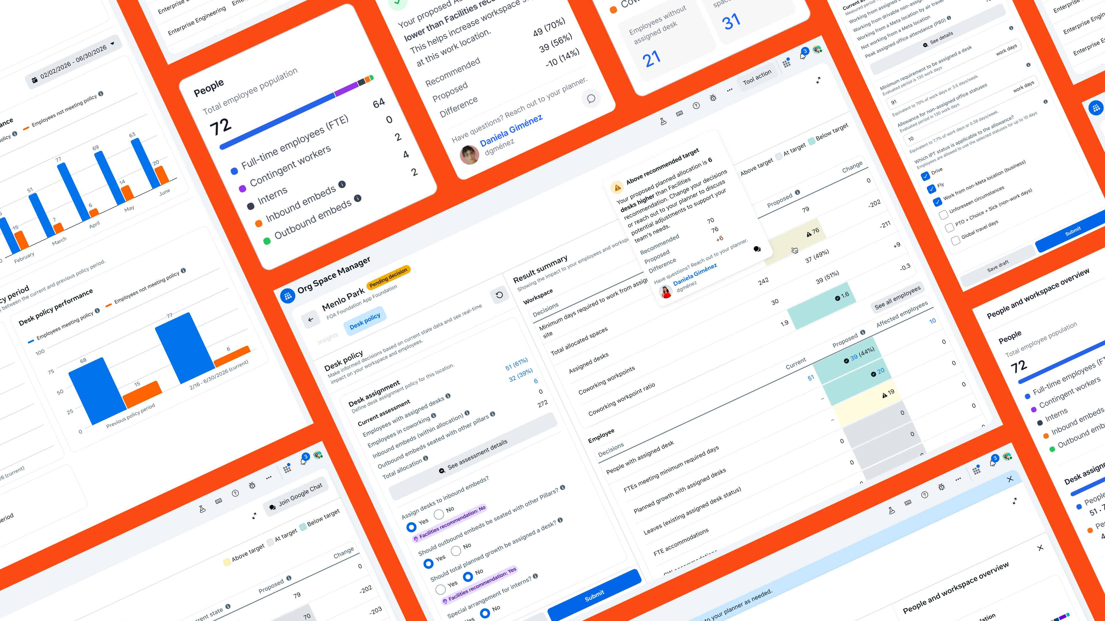
Org Space Manager is Meta’s first space planning and allocation tool — built to give leaders across organizations real-time insight into how employees use workspaces, and the confidence to make decisions that lift team productivity and workspace utilization.
Planning that is sprawled across spreadsheets, decks, and multiple internal tools now happens in one place: leaders see headcount, desk inventory, and policy impact update as they plan, and every decision moves through a single, visible workflow.
01 The research
Before thinking about a solution, I partnered with our UX researcher and sat in ~15 study sessions with org leaders from the company’s four biggest orgs. We mapped out how planning really works today, and looped in the planners to understand every hand-off between them and the leaders.
02 The problem
Org leaders had to navigate an overly complex process built around the planners — waiting weeks for answers while decisions bounced between tools, threads, and teams.
Every allocation cycle forced org leaders through an overly complex, planner-defined process — lengthy wait times and excessive back-and-forth between the two parties.
The workflow and its data lived across multiple spreadsheets and internal systems, so every step meant manual reconciliation — slow and quietly error-prone.
Communication was scattered across different channels, making discussions hard to follow and decisions hard to trace back to their context.
Without one shared thread or source of truth, team members often reached conflicting conclusions — and plans moved forward misaligned.
03 The process
After plenty of trial and error, I landed on a new design framework that let the engineers and me co-develop the same product, minimizing manual design work and speeding up the delivery timeline.
Before · the classic framework
After · the AI-first framework
04 Principles & framework
Six principles kept a dense, policy-heavy domain honest while the product came together.
Every lever shows its downstream impact immediately. Nobody should approve a number they can’t feel.
Policy is the thing you design — surfaced and editable — not a setting buried three menus deep.
A single plan model scales across every campus and org, instead of a bespoke sheet per quarter.
Surface risk inline — a projected deficit, a broken threshold — and keep the human in the decision.
The assistant answers across plans and recommends — it never silently automates the call.
Shared, legible state from draft to live, so authors and approvers read the same picture.
Defined the plan as a first-class object and a five-state lifecycle everyone could see.
Built the policy + assessment model and a status system that scales to 9 × 4 contexts.
Modeled projected impact and pressure-tested it against real deficits and edge scenarios.
05 The solution
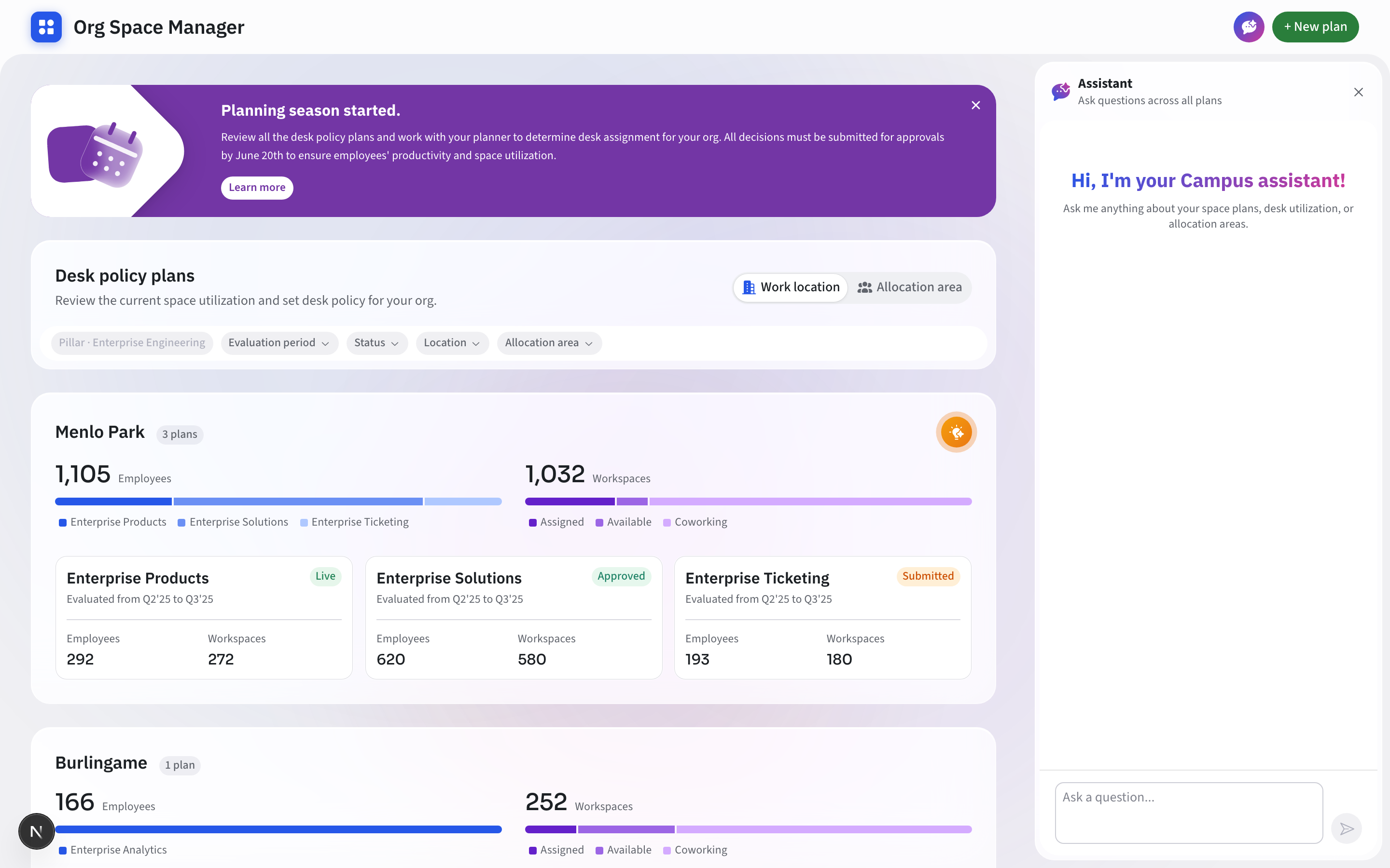
Org Space Manager centralizes every plan into a single surface — org leaders see the current state at a glance, review impact as they plan, and track each plan through its entire lifecycle.
Campus groups set the rhythm, paired utilization bars give each org a visual fingerprint, and colour-coded status chips — Live, Approved, Submitted — carry the whole lifecycle in a single glance.
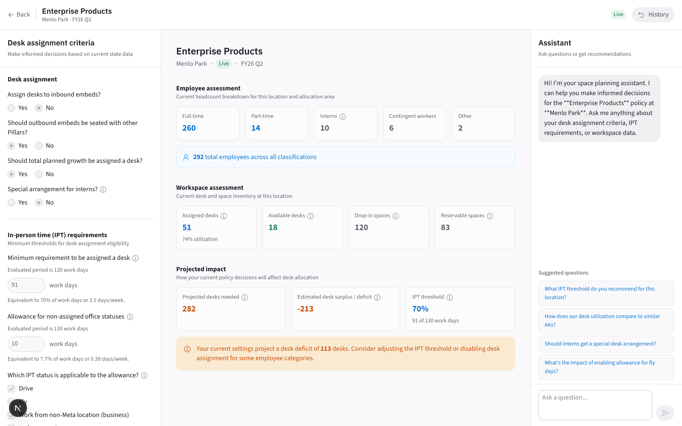
Policy controls on the left, the live assessment in the centre, projected impact on the right. The composition does the explaining — move any lever and numbers, warnings and guardrails respond across the canvas instantly.
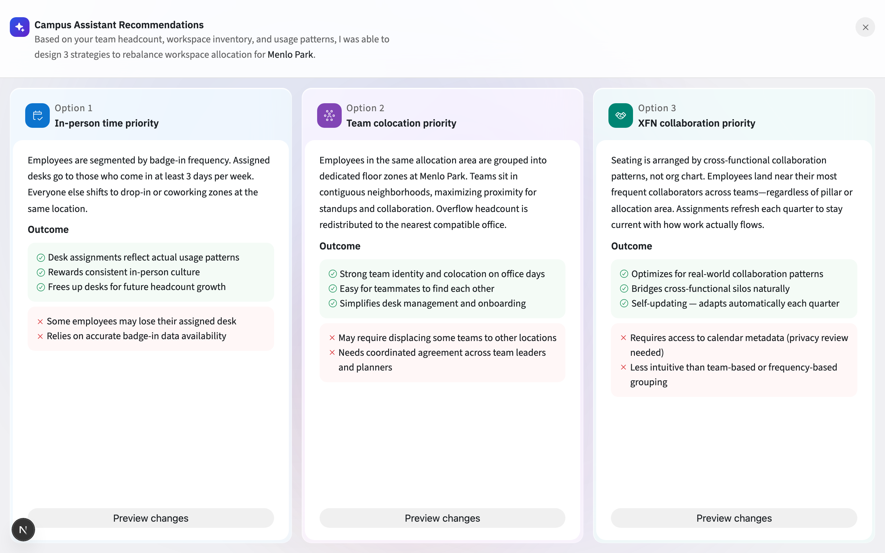
Every AI-drafted strategy card shares the same anatomy — title, approach, then outcomes as colour-coded pros and cons — so three options compare at a glance, and “Preview changes” keeps the final call with the human.
06 The deliverable
Three connected surfaces — the dashboard, the plan, and the assistant — running on one model.
Outcome figures above are illustrative placeholders for this portfolio — replace Weeks → days and the rest with your measured results.